Your coffee shop has maybe three seconds to make an impression before someone opens Google to find the next place down the street. The menu board, the cup sleeve, the Instagram grid — every visual touchpoint is either building trust or eroding it. Most independent coffee shops are losing that battle without realizing it.
Walk through any commercial district and count how many coffee shops use brown-and-cream palettes that are indistinguishable from the place three doors down. Brown is comfort. Brown is safe. Brown is also forgettable at 50 meters.
The coffee shops that actually build followings — the ones whose customers photograph their lattes and post them without being asked — almost always have a color story that goes beyond "coffee colors." Blue Bottle Coffee built its identity around clinical white and deep blue. Joe & The Juice went pink-and-black. Stumptown owns rust-orange and dark charcoal.
Your brand colors need a job. They need to communicate something specific about your customer experience — not just "we serve coffee." The most effective coffee shop brand colors in 2025 lean into contrast: one bold accent color (deep green, warm rust, electric orange) against a neutral base.
The most common logo mistake independent coffee shops make is cramming the whole menu into the design. A strong coffee shop logo does one thing: it makes your name instantly recognizable at thumbnail size. It works in black and white on a paper bag. It works as a tiny watermark on a loyalty card. It works as a square icon on Instagram.
Most coffee shop owners think about the logo and stop. But your brand is appearing in places you haven't thought about: Instagram Stories frames, Google Business Profile images, delivery platform listings, Yelp photos, TikTok video thumbnails, loyalty app icons. Each of these has different dimensions and display contexts. Your logo needs to work as a square, a rectangle, and a tiny favicon.
Walk into five coffee shops in your neighborhood and count how many have: a logo that communicates something specific, consistent colors across their cup and bag, social media that feels intentional. In most markets, you'll find one. That's the opportunity.
In 2026, independent coffee shops are leaning into distinctive visual identities to stand out in an increasingly homogenized market. The best logos now follow the "micro-first mark" trend — recognizable at 1-inch size, working in one color, and scaling from a loyalty card to a truck wrap. AI logo generators like BrandSnap now produce type-collage wordmarks and responsive identity systems that adapt to different layouts. Most importantly, the full brand kit — palette, fonts, social templates, and brand guidelines — is now available on the free tier, eliminating the gap between "logo download" and "usable brand identity."
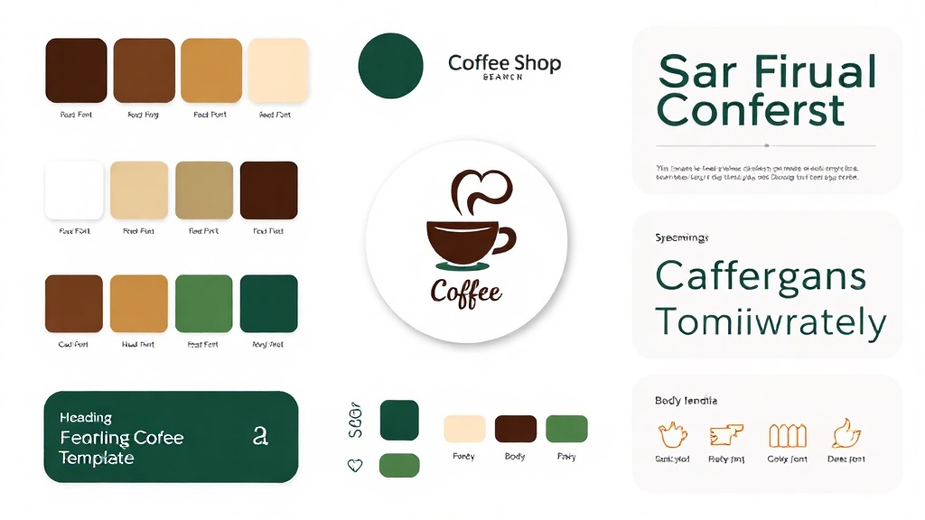
What Your Coffee Shop Brand Kit Looks Like
A real sample generated by BrandSnap AI — logo concepts, color palette, and font pairing for a coffee shop brand.
Real Coffee Shop brand kits
Browse logos, palettes, and fonts from real Coffee Shop businesses generated on BrandSnap AI.
What's Included in Your Brand Kit
One complete brand identity, ready to use across every touchpoint.
What a great Coffee Shop brand looks like
- ✓ Deep espresso browns + warm cream as base, with one bold accent color
- ✓ Typography balances craft credibility with neighborhood warmth
- ✓ High contrast between light and dark zones for drink menus
- ✓ Logo mark that works as a small circle avatar for social profiles
Generate Your Coffee Shop Brand Kit Free →
Takes 60 seconds. No account required. Real SVG assets you can use immediately.
Create my Coffee Shop brand kit →What brands are saying
"I went from idea to brand kit in 10 minutes. No designer, no back-and-forth."
Sarah K. · Boutique Owner
"Switched from Looka to BrandSnap and cut my branding costs by 60%."
Marcus T. · Founder
Branding insights for Coffee Shop businesses
Questions About Coffee Shop Branding
Warm browns, deep greens, muted earthy tones with one bold accent. The key is contrast — one bold color against a neutral base. Avoid blending into every other coffee shop's palette by using a color that signals something specific about your customer experience.
Keep it simple. It needs to work in black and white at small sizes — on a paper bag, a loyalty card, a social media avatar. Don't try to include the whole menu in the design. One distinctive symbol or a clean wordmark is all you need.
At minimum: Instagram feed (1080x1080), Stories (1080x1920), and Facebook cover (820x312). Your brand kit should include properly sized assets for each of these — not just the logo, but a coordinated set of templates.
Agencies charge $500–$5,000+ for a custom brand identity. BrandSnap generates a complete coffee shop brand kit — logo, colors, fonts, and brand guidelines — in 60 seconds. Free to start.
Yes. Your brand appears on menus, packaging, social media, and delivery platform listings before your first customer walks in. Starting with a coherent visual identity prevents the patchwork approach that most new coffee shops fall into.
Related Brand Kit Pages
BrandSnap vs the competition
| Feature | BrandSnap | Looka | Canva | Design.com |
|---|---|---|---|---|
| Free tier | ✓ Full kit | 1 logo only | ✓ Limited | Logo only |
| Brand kit | ✓ All assets | ✓ Basic | ✗ Extra cost | ✗ Extra cost |
| SVG export | ✓ Included | Pro only | ✓ Free | Pro only |
| Commercial rights | ✓ Pro tier | Pro tier | ✓ Team plan | Pro tier |
| AI generation | ✓ In 60s | ✓ In 5min | ✓ Template | ✓ Basic |
| Social templates | ✓ 12+ included | ✗ Extra | ✓ Free | ✗ |
| Turnaround | < 60 seconds | 5–10 minutes | DIY | 5–15 minutes |