Here is a stat worth tattooing on your hand: 72% of diners use social media to research restaurants before visiting, and 68% specifically check a restaurant's social profiles before deciding where to eat. That's not a trend — it's the baseline in 2025. If your visual identity doesn't communicate clearly on a phone screen, you're invisible to a massive portion of potential customers before they ever walk through your door.
Restaurants obsess over food quality (rightfully so) and then ship their menu as a Microsoft Word document. Customers assume the food quality matches the menu quality. An amateur menu signals amateur food.
The most common restaurant branding mistake: using different logo versions in different places. Your logo on the menu is a different shade than the one on your Instagram header. Your font on the website is close to — but not the same as — the one on your staff shirts.
A real brand kit solves this. You have one logo, one color palette with hex codes, one font pairing, and a set of properly sized templates for every touchpoint.
Restaurant color strategy is different from most industries because your palette has to work alongside food photography. Fast casual and approachable: warm yellows, burnt orange, heritage red. Fine dining and upscale casual: charcoal, deep navy, cream, with one metallic accent (gold, brass). Farm-to-table and natural: earth greens, warm browns, cream, soft ivory. Street food and food trucks: bold, high-contrast — bright yellow, deep red, bold black.
The modern restaurant brand appears across: Instagram feed and Stories, TikTok video thumbnails, Google Business Profile, DoorDash/Uber Eats storefront, Yelp photos, your website hero image, printed menus, staff uniforms, takeout packaging, loyalty card app icon.
Walk through the five highest-rated independent restaurants in your neighborhood. Check their Instagram, their website, their Google Business Profile. Count how many have: a consistent color palette, a logo that reads at small sizes, a social media grid that looks intentional. In most markets, you'll find one or two. The rest have great food and inconsistent visuals. That's your gap.
Restaurant branding in 2026 is inseparable from social media performance. A brand identity that photographs poorly on a phone loses in the algorithm before the food even arrives. The 2026 trend is "aesthetic coherence" — the same palette, typography, and logo style across physical menus, Instagram grids, and delivery platform listings. AI logo generators now produce responsive identity systems where one logo file adapts to square, portrait, and wide formats automatically. The best part for new restaurateurs: the complete brand kit including color palette, font pairing, and social templates is available on the free tier, eliminating the gap between "downloaded a logo" and "had a brand."
What Your Restaurant Brand Kit Looks Like
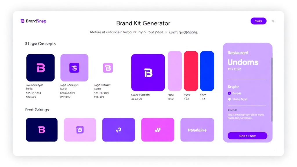
A real sample generated by BrandSnap AI — logo concepts, color palette, and font pairing for a restaurant brand.
Real Restaurant brand kits
Browse logos, palettes, and fonts from real Restaurant businesses generated on BrandSnap AI.
What's Included in Your Brand Kit
One complete brand identity, ready to use across every touchpoint.
Generate Your Restaurant Brand Kit Free →
Takes 60 seconds. No account required. Real SVG assets you can use immediately.
Create my Restaurant brand kit →What brands are saying
"I went from idea to brand kit in 10 minutes. No designer, no back-and-forth."
Sarah K. · Boutique Owner
"Switched from Looka to BrandSnap and cut my branding costs by 60%."
Marcus T. · Founder
Branding insights for Restaurant businesses
Questions About Restaurant Branding
Warm colors (yellows, oranges, heritage reds) for fast casual; dark neutrals (charcoal, navy, cream with gold/brass accent) for fine dining; earth tones (greens, browns, ivory) for farm-to-table. The palette also needs to look good next to food photography — test your colors against actual photos before committing.
Your logo needs to work as a square (Instagram avatar), a wide rectangle (TikTok/Google cover), and a tiny favicon. Most restaurant logos fail on social because they were designed for print and then poorly adapted for screens. A proper brand kit provides correctly sized versions for each context.
Yes. 68% of diners check social profiles before deciding where to eat. Your DoorDash, Uber Eats, and Google Business Profile storefronts should all use the same logo, colors, and visual language — inconsistency signals a business that doesn't have its act together.
Inconsistency: different fonts and colors on the menu, the website, and social media. It signals to customers that you don't pay attention to detail — and they assume your food is the same way. One coherent brand applied across every touchpoint is the fix.
Agencies charge $1,000–$10,000 for a restaurant brand identity. BrandSnap generates a complete restaurant brand kit — logo, color palette, social templates, brand guidelines — in 60 seconds, free to start.
Related Brand Kit Pages
BrandSnap vs the competition
| Feature | BrandSnap | Looka | Canva | Design.com |
|---|---|---|---|---|
| Free tier | ✓ Full kit | 1 logo only | ✓ Limited | Logo only |
| Brand kit | ✓ All assets | ✓ Basic | ✗ Extra cost | ✗ Extra cost |
| SVG export | ✓ Included | Pro only | ✓ Free | Pro only |
| Commercial rights | ✓ Pro tier | Pro tier | ✓ Team plan | Pro tier |
| AI generation | ✓ In 60s | ✓ In 5min | ✓ Template | ✓ Basic |
| Social templates | ✓ 12+ included | ✗ Extra | ✓ Free | ✗ |
| Turnaround | < 60 seconds | 5–10 minutes | DIY | 5–15 minutes |