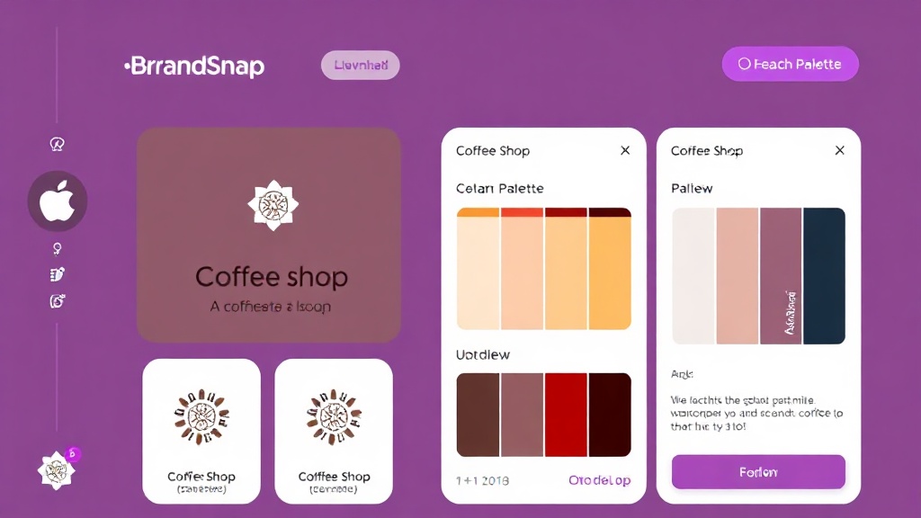
Restaurant branding in 2026 is inseparable from social media performance. A logo that photographs poorly on a phone loses in the algorithm before the food arrives. The 2026 trend is 'aesthetic coherence' — the same palette, typography, and logo style across physical menus, Instagram grids, and delivery platform listings. AI logo generators now produce responsive identity systems where one logo file adapts to square, portrait, and wide formats automatically. The complete brand kit including color palette, font pairing, and social templates is available on the free tier, closing the gap with competitors who paid $500+ for agency branding.
6 Logo Concepts for Restaurant Brands
Each concept includes a suggested color palette, description, and style tags — use them as inspiration to define your own brand identity.
Warm wood browns, cream, and forest green. Feels handcrafted and farm-to-table — for farm-to-fork restaurants, gastropubs, and independent neighborhood eateries that emphasize sourcing.
Matte black and warm cream with gold accent. Elegant and contemporary — for upscale bistros, modern fine dining, and chef-driven restaurants targeting foodies and special occasions.
Red, orange, and navy — bold and appetizing. Street food energy with mainstream appeal. For fast-casual restaurants, food halls, and creative fast-serve concepts that need to move quickly.
Ocean blue through to light aqua — seafood and coastal dining vibes. Fresh, clean, and appetizing without being overly nautical. For seafood restaurants, oyster bars, and coastal casual dining.
Charcoal base with burnt orange and warm cream. Global flavors with an urban edge — for Asian fusion, Mediterranean, and global street food concepts targeting young urban diners.
Sage green and warm cream with amber accents. Grounded, welcoming, and family-oriented — for family restaurants, diners, and neighborhood spots where comfort food is the product.
Common Design Patterns in Restaurant Logos
Restaurant logos use warm, appetizing colors — reds, oranges, golds, and creams dominate for most cuisines. Upscale and fine dining shift to black, navy, and gold. Typography ranges from elegant serifs (upscale) to rounded sans-serifs (casual). Fork, knife, plate, and glass iconography is common but the best logos avoid clichés.
What Colors Say About Your Restaurant Brand
Color choice is one of the most powerful brand decisions — here is why these colors work for restaurant businesses.
Scientifically proven to stimulate appetite and urgency — the dominant color for fast-casual and takeaway restaurants.
Signals quality, craft, and premium positioning without the heaviness of black. Works across upscale and mid-market.
Farm-to-table and health-forward signal for farm-and-table restaurants and conscious dining concepts.
Instantly signals seafood, coastal dining, and freshness. Works for any restaurant with water or marine themes.
Generate Your Restaurant Logo Free →
3 logo concepts, color palette, font pairing, and brand voice — all in under 60 seconds.
Create my Restaurant logo →Get the Full Brand Kit for $19 →
BrandSnap vs Looka vs Canva vs Design.com
| Feature | BrandSnap | Looka | Canva | Design.com |
|---|---|---|---|---|
| Free tier | ✓ Full kit | 1 logo only | ✓ Limited | Logo only |
| Brand kit | ✓ All assets | ✓ Basic | ✗ Extra cost | ✗ Extra cost |
| SVG export | ✓ Included | Pro only | ✓ Free | Pro only |
| Commercial rights | ✓ Pro tier | Pro tier | ✓ Team plan | Pro tier |
| AI generation | ✓ In 60s | ✓ In 5min | ✓ Template | ✓ Basic |
| Social templates | ✓ 12+ included | ✗ Extra | ✓ Free | ✗ |
| Turnaround | < 60 seconds | 5–10 minutes | DIY | 5–15 minutes |
What founders are saying
"I went from idea to brand kit in 10 minutes. No designer, no back-and-forth."
Sarah K. · Boutique Owner
"Switched from Looka to BrandSnap and cut my branding costs by 60%."
Marcus T. · Founder
Frequently Asked Questions About Restaurant Logos
Consider your cuisine type and price point: upscale dining benefits from dark backgrounds and elegant typography; fast-casual and family restaurants should lean warm and approachable. Test your logo in black-and-white — most printed menus and delivery platforms use limited color options.
Red and orange are the most appetizing colors — they increase urgency and stimulate hunger. Upscale restaurants should use black, navy, and gold instead. Always test your logo on takeout containers and menu designs before printing.
An icon adds recognition but can feel generic. Better to use a distinctive abstract mark — a geometric shape, monogram, or stylized letter — paired with a strong wordmark. Literal food icons date quickly and reduce versatility across menus, signage, and delivery platforms.
Yes — file under Class 43 (restaurants and food services). You can file an intent-to-use application before opening day. Trademarking your logo prevents competitors from using a similar brand identity in your geographic area.
BrandSnap AI generates three complete restaurant logo concepts in SVG — optimized for menus, takeout containers, social media, and delivery platforms. Free for one kit, delivered in under 60 seconds, ready for immediate use.