The yoga industry in 2025 is saturated. Studio density has tripled in most cities since 2019, and every operator is fighting for the same 30-something wellness-minded customer who compares studios the way they compare restaurants. Your pricing, your schedule, your teacher lineup — those are table stakes. Your brand is how you win or lose before someone even walks in.
Walk into five yoga studios and count the sage-green logos. The lotus flower icons. The "namaste" scripts. That's not branding — that's category noise. When your visual identity looks like every other studio in your zip code, you become a commodity, which means you're competing on price.
The studios with loyal followings have a brand that says something specific. Not "yoga studio" but "the kind of yoga studio where [specific type of person] feels at home."
Color psychology for yoga studios — pick a lane. Hot yoga and power yoga: warm colors (deep orange, terracotta, amber) against dark bases signal energy and intensity. Restorative and yin yoga: muted earth tones, soft sage, warm ivory, dusty lavender communicate calm and non-urgency. Premium and boutique: navy-and-gold, black-and-white with one accent color signal exclusivity and intentionality.
Yoga studios default to two bad font choices: script fonts that try to evoke spirituality but end up unreadable, or overused sans-serifs like Helvetica that communicate nothing. The studios with the most coherent visual identity use clean sans-serif fonts for headlines paired with either a warm serif or a hand-lettered accent font for secondary text.
Your logo appears on: class schedule cards, staff T-shirts, mat stickers, Instagram bio photo, Google Business Profile, ClassPass listing, Yelp photos, YouTube channel art, client intake forms, and email headers. Each requires properly sized, scalable assets.
Most independent yoga studios haven't invested in brand design. They're running Canva templates from 2021. Their Instagram grid is a random collection of stock photos with no visual coherence. That means the bar for "professional-looking" in this category is lower than you think.
The yoga studio branding landscape in 2026 has shifted decisively toward minimal, high-contrast identity systems. The dominant trend is the "responsive identity" — a logo that works as a tiny favicon on a booking app, a large banner on a studio wall, and a social media avatar, all from one design. AI-powered brand kit generators have changed the economics: studios that previously waited months for a design agency now generate complete brand identities in 60 seconds, with SVG exports and Google Fonts integration included on the free tier. The studios winning the social-media game have brand colors that pop in a 3-second thumbnail — deep contrast, one bold accent, minimal chrome.
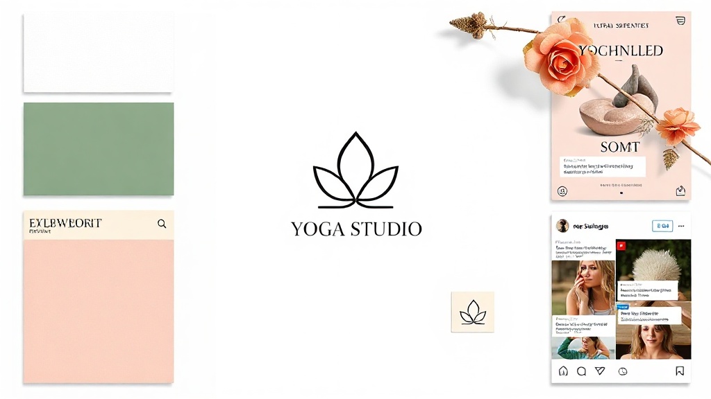
What Your Yoga Studio Brand Kit Looks Like
A real sample generated by BrandSnap AI — logo concepts, color palette, and font pairing for a yoga studio brand.
Real Yoga Studio brand kits
Browse logos, palettes, and fonts from real Yoga Studio businesses generated on BrandSnap AI.
What's Included in Your Brand Kit
One complete brand identity, ready to use across every touchpoint.
What a great Yoga Studio brand looks like
- ✓ Calming, nature-inspired palettes: soft teals, warm ivories, sage greens
- ✓ Clean, minimal typography — readable at small sizes on studio signage
- ✓ Low saturation, high whitespace — the brand breathes
- ✓ Logo mark that works as a watermark on mats and props
Generate Your Yoga Studio Brand Kit Free →
Takes 60 seconds. No account required. Real SVG assets you can use immediately.
Create my Yoga Studio brand kit →What brands are saying
"I went from idea to brand kit in 10 minutes. No designer, no back-and-forth."
Sarah K. · Boutique Owner
"Switched from Looka to BrandSnap and cut my branding costs by 60%."
Marcus T. · Founder
Branding insights for Yoga Studio businesses
Questions About Yoga Studio Branding
Blues, greens, neutral grays for calm studios; warm oranges for power yoga; muted earth tones for restorative practices. The key is choosing one direction and committing. Your color palette should feel the same whether it's on your website, your studio signage, or your Instagram Story frame.
Both work. A combination mark (symbol + name) gives you more flexibility across different placements. A wordmark-only logo only works if your chosen typeface is distinctive enough that someone who sees it on a friend's water bottle recognizes it immediately.
Instagram feed (1080x1080), Stories (1080x1920), Facebook cover (820x312), and YouTube channel art (2560x1440). Your brand kit should include properly sized templates for each — not just a resized logo.
Limit to 2–3 colors maximum. Use a clean sans-serif font for headlines paired with a warm serif or hand-lettered accent. Consistency matters more than complexity — the same palette applied consistently across every touchpoint is what reads as premium.
Trying to appeal to everyone. Every yoga studio looks the same because everyone is trying to be all things to all people. A specific niche — power yoga for athletes, trauma-informed yoga for survivors — allows for a much stronger, more distinctive brand identity.
Related Brand Kit Pages
BrandSnap vs the competition
| Feature | BrandSnap | Looka | Canva | Design.com |
|---|---|---|---|---|
| Free tier | ✓ Full kit | 1 logo only | ✓ Limited | Logo only |
| Brand kit | ✓ All assets | ✓ Basic | ✗ Extra cost | ✗ Extra cost |
| SVG export | ✓ Included | Pro only | ✓ Free | Pro only |
| Commercial rights | ✓ Pro tier | Pro tier | ✓ Team plan | Pro tier |
| AI generation | ✓ In 60s | ✓ In 5min | ✓ Template | ✓ Basic |
| Social templates | ✓ 12+ included | ✗ Extra | ✓ Free | ✗ |
| Turnaround | < 60 seconds | 5–10 minutes | DIY | 5–15 minutes |